<img src="//bat.bing.com/action/0?ti=5091976&amp;Ver=2" height="0" width="0" style="display:none; visibility: hidden;">
Take your online training program to the next level
GET STARTED WITH NORTHPASS

The Beginner's Guide to Creating an Online Training Program

Step 3

Build the Course

This step of the beginner’s guide contains numerous examples and tips for creating online training content. To make it easier to follow and more useful, we structured it a bit differently than the other steps. You’ll notice shorter sections containing highly practical information for content development. These short “bursts” of content are meant to be less conceptual and theoretical and more actionable, with instructions and examples for creating great course content.

As you prepare to build your first course, remember that this is an iterative process. This is an important point to recognize because people frequently misunderstand what it takes to launch an online program. People often imagine an extensive course catalog with fully designed, highly interactive learning activities. While that is a great goal to strive for, those components aren't necessary for launching your first course. Indeed, aiming for perfection from the start can be detrimental to your program’s success.

image-column

Done is Better than Perfect

The phrase, “done is better than perfect,” could not be more true in this context. Why? Because feedback from your users is your most valuable tool during the beginning stages. Feedback provides you with insight into the minds of your target audience, helps you understand their problems and enables you to create a training experience to fit their needs.

The last thing you want to do is create a 50-course training academy and find out later that a critical piece of it doesn't work for your target audience. Without feedback, you’re simply guessing about your learners’ needs, and that’s no way to approach an initiative that has to give your business good ROI from day one.

Start Small

The sooner you can solicit feedback, the sooner you can create a highly targeted training program. To do this, you should first launch a pilot to a sample of learners. Start small. Build out one simple course with a feedback survey and see how your learners respond. Then take that feedback and apply it to future courses.

Facebook demonstrates this methodology well. As Mark Zuckerberg once said: “Hackers try to build the best services over the long term by quickly releasing and learning from smaller iterations rather than trying to get everything right all at once. To support this, we have built a testing framework that at any given time can try out thousands of versions of Facebook. We have the words ‘Done is better than perfect’ painted on our walls to remind ourselves to always keep shipping.”

The idea he describes can be applied beyond product development. Training programs could and should be just as agile. That said, let’s talk about content design and development.

Design is Critical

Great design in online training is not just about making something look good. It’s about visually communicating the value of your content to your audience. Think about the last time you visited a poorly designed company website. Before reading any of the copy, what was your first impression? I’d bet you questioned the quality, validity or integrity of the business. You may have moved on to the messaging or abandoned the site completely. This is the last thing you want learners to do when they navigate into your course.

Caption loreum ipsum for individual images

Well-designed courses should make learners feel assured that the content is valuable, engaging and worth their time. And this has to happen quickly, in less than 15 seconds to be precise. This is the amount of time most people spend on websites (Time, 2014). So, unless you’re implementing mandatory training, you must compel your learners to engage with your content in less than 15 seconds. Even if your training is mandatory, you want learners to be motivated to move forward. The easiest way to do that is to implement design best practices in your courses.

Your design should align with the tone of your course. For example, if you’re from a B2C company offering travel services to millennials, you might incorporate light colors and playful illustrations. If you’re from a B2B SaaS company targeting fortune 500 businesses, a sleek, minimalistic design may be more appropriate. Both your content and your design should cater to your target audience.

The reality is that poorly designed courses can be filled with useful, interesting and reliable content, and beautifully designed courses may lack substance. But the most powerful online training courses offer both great design and great content. The design offers an inviting visual that pulls the learner into the content, while quality content keeps the learner engaged and fosters knowledge transfer.

fpo-icon.svg

Making your content readable

Great design should clear any blockers that may prevent learners from wanting to or being able to engage with your content. Readability and legibility may very well be the biggest blockers of your content because if learners can’t read the text, they can’t consume the information.

Readability and legibility are often used interchangeably. However, in the context of design, it’s important to understand the difference. Readability refers to the way text is arranged on a page, which determines the ease with which a reader is able to understand what is written. Legibility is how a typeface (family of fonts) is designed and how distinguishable each character of the typeface is.

Both are important to your learners’ success because they affect their ability to read and navigate through your content. Your course should be so frictionless that learners won’t give those elements a second thought.

Legibility

The legibility of a typeface differs depending on how you plan to display it. Consider the context in which the typeface will be used. In what size will it be displayed? Will it be used as a headline, subheadline or in body copy? Does the typeface complement your target audience? Here’s how you determine the perfect typeface for your content.

The size in which the typeface displays matters because certain typefaces were created to be shown large while others were designed to work for body copy. Find a typeface that is appropriate for the intended size and area where it’ll be used.

Below is a typeface called Goudy Bookletter. It's an example of a typeface that looks great as a large headline but can be difficult to read as body text.

There is an ongoing debate about the legibility of serif versus sans serif typefaces. In the past, serif typefaces were said to be better in print, while sans serif fonts were thought to be more legible on screen. However, this is not a hard and fast rule. Use the typeface in context with your specific content and see how it looks. If it reads easily, looks good and makes sense for your target audience, use it!

Both examples below make for great body text due to their legibility. On the left, is a sans serif font called Roboto and on the right, is a serif font called Lustria.

Readability

Remember that readability is about how text is arranged on a page. Copy with great readability allows the learner’s eyes to quickly and easily access the content.

The first thing to consider when dealing with readability is spacing—the spacing between lines of text and the spacing between paragraphs. Typically, you’ll want the spacing between paragraphs to be larger than the spacing between lines within the same paragraph. The idea is to make passages look like they are held together. Take a look at the example below.

We discussed sizing in terms of legibility, but it is also important for readability. The size of your text impacts how readable it is to the learner. Consider your target audience. Where will they be accessing the content (on a desktop, laptop or mobile device)? Will they be able to read the text in the size you’ve chosen? Keep in mind that eyesight quality may vary, especially with older audiences. A font size around 13px is typically reasonable.

section-img-3-1.png

The width of your text line can also impact readability. For example, if your text stretches too wide, it may make it cumbersome for the learner’s eyes to go from reading the end of one line on the right to the beginning of the next line on the far left. Wider text blocks also appear more intimidating to learners, which creates a blocker that may lead to drop off. As a general rule, your text line width shouldn’t stretch further than 70 to 90 characters.

For example, the passage below is too wide:

Whereas the passage below is a good width:

The importance of contrast in the color of your text to the color of your background may sound obvious, but it’s worth a mention. The rule is simple: dark text on light backgrounds and light text on dark backgrounds. For body text, we recommend sticking with the former, and avoiding too much text with bright colors that may strain the eyes or distract the learner. An example of a distracting color palette is provided on the right below. The bright background makes it difficult to read the body text. Alternatively, the example on the left offers a more neutral background and dark body text, providing better contrast and readability. Adobe offers a great tool for finding the right color palette.

Caption loreum ipsum for individual images

Creativity is a big part of design, but in online training design, readability and legibility trump all else. That doesn’t mean you can’t be unique in your design; it just means you need to prioritize readability and legibility. By making your content easy to read, the learner can spend more energy appreciating the design and gleaning knowledge from the content.

fpo-icon.svg

Formatting your content

The format of your content is essential for naturally guiding the learner through the training experience. Whether it be a sequential path or a focal point, format allows you to lead the learner’s eyes through a predesignated flow. Let’s discuss how you can accomplish this visual flow with your content.

Hierarchy

Create a hierarchy to help the learner understand how the information is organized and which assets or pieces of information should be accessed first, second, third and so forth. You can accomplish this by using headlines, sub-headlines and paragraphs. You can also leverage different colors, typefaces, font and image sizes, alignment and placement of elements in your course activities. A great visual hierarchy accomplishes three goals:

  • It communicates sequence and/or relative importance.
  • It makes elements flow smoothly from one to another.
  • It makes the content easy to scan.

Chunking

Chunking is an approach for making better use of short-term memory by grouping information into "chunks"—it is an art achieved through simplification. According to Cognitive Load Theory, learners absorb and retain information best when it is presented in a way that does not overwhelm their mental capacity. Our brains can only hold so much information in our short-term and working memories. When too much information is presented, learners can't properly consume or recall the information later. Consider this theory when chunking your content.

The first step in chunking requires decluttering your content, removing any fluff and keeping only the most critical assets. Next, take those assets and divide and organize them into digestible chunks. Content that's “digestible” should only take the learner roughly five minutes to consume. Each chunk should serve as its own course activity.

Once you have those smaller chunked activities, simplify some more! Break up large paragraphs, add in paragraph titles and use bullet points where appropriate. The goal is to avoid visually overwhelming the learner.

The examples below demonstrate what we're getting at. The example on the left is un-chunked content, while the right example is chunked. The chunked example looks a lot easier to read through and digest.

Caption loreum ipsum for individual images

Focal point

In each activity, there should be one focal point. The focal point is the area where you want to draw the learner’s attention to a concept that is of particular importance. To do this, use a block quote, upload a photo, add an infographic, tell a short story or integrate a chart or graph.

Whitespace

Modern learners are inundated with information and, as a result, filter out most of it. Don’t let your content be caught in these filters. When people are presented with too much content close together, it makes it difficult for them to focus. To help with this, add plenty of whitespace in your content. This is the empty space (which doesn’t necessarily have to be white) on the inside, outside and around your content. Use it to separate elements on a page and give your learners some breathing room. As a good rule of thumb, whitespace should occupy anywhere from 25% to 40% of the page.

Alignment

Alignment allows the brain to associate elements with one another. Typically, learners perceive elements grouped together vertically or horizontally as related. Make sure you align the elements in your content properly to streamline the learner’s ability to quickly scan through and categorize information.

Let's review…

fpo-icon.svg

Selecting your images

Images add value to your content because they enhance the narrative you’re telling. They are tools for storytelling and, when used effectively, can captivate your learners quickly and powerfully. In this section, we’ll cover the best practices for selecting the right images for your courses.

Relevance

The first factor to consider when selecting images is relevance. Start your search with an idea of what you’re looking for. The big piece of this is your target audience. Their age, cultural characteristics, professional background, etc. should help you determine whether an image would make sense or is relatable to them.

Let's say your target audience includes small restaurant owners in the U.S. In the example above, the photo on the left contains a menu written in Italian—this may not be the best pick. On the other hand, the photo on the right fits your audience perfectly.

You’ll know an image’s relevancy to your topic almost immediately upon seeing it. If you have to spend time looking for ways a photo might work for your content, it’s likely not the right image.

Purpose

Next, think about whether the image helps you communicate and reinforce your message. The goal of an image should never be to simply fill space, but rather to serve a specific purpose. The image you select should help your learners grasp the concepts presented in your content.

In some cases, a great image can replace text because it communicates the sentiment better than any words can. For example, a travel company promoting Halong Bay, Vietnam as a destination can do much more with the photo on the right than they could with the photo on the left (above), or any text for that matter.

Emotion

Choose visuals that evoke emotion. Such images are typically the most memorable and help learners connect with the content. It's also the surest way to grab the learner’s attention and keep them engaged. Depending on your learner persona, you will need to find images that are the right balance of drama, humor or other emotion-evoking elements.

For example, if you're a company that deals with child care, the photo on the right above would likely evoke more emotion in parents than the photo on the left.

Quality

Image quality is one of the top factors to consider during the selection process. High resolution photos are critical in demonstrating the quality level of your content. Make sure your images are sharp, clear and have easy-to-see details. Image choice may change depending on how large you want the image to display. The larger the display, the higher resolution the photos need to be. Under no circumstance should you include blurry images in your content.

To create a quality course, you must preserve the integrity of your content in every element.

The photos above showcase options that a ride sharing company might select. The photo to the left has poor color and lacks focus. Meanwhile, the photo on the right offers warm colors and a crisp view of the focal point.

To the previous point, there are also different emotions tied to each of the above images. The one on the left feels like the man is commuting home from work on a cold and gloomy day. The photo on the right feels vibrant and joyful—like the man is driving to have a fun night out with his friends.

Consistency

Once you select your typefaces, formatting method and image style, keep everything consistent throughout your course. Use the same one to two typefaces throughout your course. If there’s a specific icon style you like, use the same style in every learning activity.

Maintain consistence with the photography you use as well. Take a look at the photos above. Both communicate a work environment, but each is drastically different from the other. They have different photography styles and tones and target a different learner persona. No matter what type of images you select, consistency will help reduce confusion and distraction when your learners encounter them.

Below are a few recommendations for sites that offer free images:

Creating Slideshow Presentations

Slides are no longer used solely for in-person presentations. They now serve a multitude of purposes, from enabling you to deliver ideas to your internal team to storyboarding your next online training course. They can also be used to create training videos that combine slides with audio narration.

Slides now have the functionality to engage a remote audience beyond the standard bullet points:

  • Links can be leveraged to increase interactivity.
  • Masking techniques can help put focus on a specific area in a slide.
  • Rich imagery can enhance meaning in your content.

Slide Building

All the design tips covered in the previous section can be applied when designing your slides.

Let’s start with the big picture concepts:

Delivery

How will you deliver the slides? If you’ll be doing a live webinar or creating a narrated video, less text is appropriate. Your narration will provide context, so your on-screen copy doesn’t need to. However, if narration won't be involved, you’ll need to provide enough on-screen information for the learner to understand the ideas communicated.

Chunking

Regardless of your delivery method, you should chunk your content to some degree. When dealing with slideshow presentations, simplification is key. Take a minimalist approach to text by limiting each slide to one idea and 20 to 30 seconds of content. Avoid large paragraphs of text, and instead use visuals to communicate meaning.

Transitions

Consider how you’ll transition from one topic to another. Create differentiation in the design of your slides to make it clear to the learner when you’re starting on a new topic.

Consistency

Keep your slides consistent. Select a color palette, typefaces (limit to three) and element sizes, and stick to them throughout your presentation. As knowledge transfer is the top priority, any inconsistency that could cause distractions should be removed.

Now, let’s get to the tactical tips:

Cover slide

Remember when we said you have less than 15 seconds to grab a learner’s attention during their first course interaction? When it comes to your cover slide, you only have 3 seconds. To ensure that your cover slide is compelling, include visuals that are colorful, inspiring, unexpected or funny. Avoid clichés, and be creative! This is a great way to evoke emotion right from the start.

Focus

If it takes a learner more than 10 seconds to process and understand a slide, it’s not comprehensible enough. Simplify complex ideas, or break the idea up into multiple slides with each slide covering one sub-topic. If you’re including an image or screenshot in the slide that contains multiple elements, focus on the area of interest.

One way to accomplish this is to use a “dupe-and-mask” technique shared by Aaron Weyenberg, a TED expert on slide decks. He explains:

Here’s the process for masking it. (1) Set the image transparency to something less than 100. (2) Duplicate that image so there is one directly over the top of the other. (3) Set the dup’d image transparency back to 100. and (4) Follow the technique here to mask the dup’d image. You’ll end up with something that looks like this."
- Aaron Weyenberg, TED

Integrating Interactivity

Interactivity in online training refers to “dialogue” that occurs between the learner and the content. It typically requires that the learner take some action to reach a specific outcome. Interactivity is effective for engagement and retention because our brains have a natural desire to explore. We make a hypothesis, test our hypothesis (by doing) and come to a conclusion. By making your content more interactive, you are giving the learner the opportunity to learn by doing, as opposed to passively receiving the information.

The best way to make a presentation interactive is to add links. There are two types of links to consider: external and internal.

External Links

External links are links to external sites. They should be used to provide learners with additional resources. As in-depth as your content may be, the web offers a wealth of knowledge to supplement it.

Provide learners with optional links that they can explore on their own if they find the topic particularly interesting. This is called discovery learning and enables learners to further explore the concepts presented.

Internal Links

Internal links are in-presentation links. They connect the learner to other slides in the presentation. It’s a pretty basic idea. Learners click a button on Slide 1 that leads them to Slide 5. It allows you to set up the presentation in a non-sequential or branching path. While a simple concept, it can be quite powerful in streamlining navigation.

Examples of Interactive Slides

Picture, for example, that you are tasked with implementing a live Q&A session online for your suppliers around the globe (in this scenario, they are your learners). You want each supplier to be able to easily determine the Q&A time in their time zone. Instead of listing the information for each time zone on one or more slides and forcing the learner to find theirs, you can create a slide with a map of the world, and link each time zone on the map to the slide with the appropriate information. The approach is more visually appealing, requires less work for the learner and delivers a more interactive and enjoyable experience.

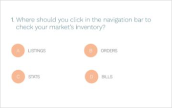
Here’s a second example. You work for an online marketplace company that intends to use training to reduce support costs. The goal of your course is to teach customers how to create and manage their first listing. Instead of creating a multiple-choice question that asks, “Where should you click first in the navigation bar to view your inventory?,” you can create a slide with a screenshot of the admin panel and navigation bar and add clickable hot spots on the screenshot. One hot spot is linked to the slide informing the learner that their response is correct, while the others are linked to a slide with a “Try again” message. In this scenario, learners are applying what they learned from the content directly to a real-world scenario—which is ideal!

presentation tools

PowerPoint, Keynote and Google Slides are the big players in the slide presentation software market, and for good reason. PowerPoint is an old favorite and continues to be fully capable of producing great decks. Keynote wins in terms of interface design and built-in templates that are trendy and less overused than their PowerPoint counterparts. Then there’s Google Slides—a free, cloud-based app built for easy collaboration and sharing.

At Northpass, we are avid users of Google Slides. If ease-of-use if important to you, you probably should use it, too! There are a few sites that offer free pre-made templates for Google Slides (as well as those for other tools such as PowerPoint and Keynote) that you can use if you don't want to design your own deck.

Google Slides Templates

Other Slide Platforms

Using Audio to Set the Tone

In this step of the beginner’s guide, we’ve focused primarily on text-based content. Now, we'll move into more media-based assets, like audio. But before we dive in, let’s talk a bit about the preconceived notion that text-based content is inferior and discuss the value of using different types of media.

Text-intensive content is effective in allowing learners to navigate through content at their own pace, focus on passages that are of particular interest to them and skim through sections that are less relevant. Though it’s easy to label text-intensive content as passive and unengaging, the flexibility it provides learners is a critical part of what makes online training great.

In the past, Howard Gardner’s Multiple Intelligence Theory suggested that eight different types of criteria account for the human potential. And at a high level, he was right. Human beings are all different. We all have different types of knowledge and expertise and different learning preferences.

So, from Gardner’s Theory came the idea of learning styles and teaching to those learning styles. The notion was that learners absorb and retain information better if they are taught from the perspective of their preferred learning style. For example, visual learners always perform better after engaging with charts and symbols than aural learners.

But there has been little concrete data to support those suppositions. In reality, learning styles matter much less than learning objectives. That’s because the topic at hand and the intended learning outcome are far better indicators of how you should conduct training to reap the best results.

Think about it. If you own a dog grooming shop and are training new hires on how to groom a dog, even learners who prefer to read content will appreciate a video demonstrating specific hair clipping techniques. On the other hand, if you’re training marketers on how to write great nurturing emails, learners will likely be more receptive to a text-based approach or screenshot.

To this point, you should never feel forced to develop content in a specific format just for the sake of creating variety in the types of media you use. Your media selection should always be based on your learning objectives. Now, if your learning objectives are best achieved through audio or video, that's great! There are benefits there, too.

Audio can be powerful when it is used to enhance the story you’re trying to tell. Your voice alone can help humanize, personalize and create emotion in your narrative. It tells your target audience that there’s a person behind the presentation who knows what they’re talking about, who has had these experiences and who’s passionate about the content they’re engaging with. Use your voice to drive your message home. You can even integrate music in the background to evoke an emotion that complements the theme of your content.

Equipment for Audio Recording

Your equipment and environment are essential for creating high-quality audio recordings. Though post-editing can work wonders in polishing and tightening up your audio, some elements simply cannot be filtered out. Consequently, you should ensure you have a decent microphone and a quiet space to record to avoid having to re-record your narration. 

There are really only two pieces of equipment necessary:

  • Microphone: An external USB microphone that can easily be plugged into your laptop or computer. Decent microphones can range from $50 and up.
  • Pop filter: Pop filters help reduce the popping and hissing sounds caused by fast moving air into the microphone when speaking. For example, the noise from overly apparent S or P sounds.

Once you have the proper equipment, find a place to record. The space you select should be very quiet. To confirm that you've found the right spot, answer the following questions:

  • Can you hear noise from neighbors that share your walls?
  • Is it a high-trafficked area with noise coming from the hallways?
  • Is it a street-facing room where outside noise may become a problem?
  • Is it under or near any vents?
  • Does your voice echo in the room when you speak?

Your best environment is a room about which you can answer “no” to all of the above questions. Perform a test recording in the room and listen to the playback using headphones to ensure the background noise is minimal.

Speaking Tips

In Step 2 of this guide, you wrote the script for your audio. First, review your script to ensure it is conversational and easy to read. Then follow the tips below for recording your reading of it:

  1. Start with a few seconds of silence. This will allow you to get a sample of the background noise to filter out when editing.
  2. To get the right sound, position your microphone about six inches away from you. Make sure your voice is loud and clear.
  3. Stand up while reading. This will help you breathe more easily, enunciate better and get energized.
  4. Mark your takes so you can easily differentiate between them. For example, start each recording with details such as, “How-To Video, Section 3, Take 1.”
  5. Speak in a conversational tone, and emphasize important words. Envision yourself talking to someone.
  6. For recordings that will be used as voiceover for a video, align your narration with what will be on the screen.
  7. Avoid inflections like ums, ahs and uhs. Ensure your sentences end in a falling / neutral tone; avoid ending in a rising tone.

The best way to determine the quality of your recording is to listen to the playback with headphones, like you did when testing for background noise. But this time, review it for any speech, tone or sound quality issues.

For some inspiration, pay attention to how the famous speakers below use their voice in a powerful way:

As an exercise before moving on to the next section, listen to your favorite podcast or audiobook. Write down exactly what elements of the speaker’s speech you enjoy the most. Revisit this list before you record your narration. Then, playback the recording, listen for those areas in your speech, and make improvements where necessary.

Using Music

The primary reason for using music in online training is to set the mood. The emotion you want learners to feel when engaging in the content should match the type of music you select. For example, think about the role music plays in movies: the adrenaline you felt when "Gonna Fly Now" played as Rocky climbed the steps or the heart-wrenching Braveheart theme song by James Horner.

Creating emotion is not the only benefit music provides for your courses. Since music is known to trigger emotional responses, it can lead to improved retention for your learners. It can also be used to create a relaxing and soothing training environment, which helps learners focus.

As you think about whether or not to include music in your courses and what type of music to include (if any), consider the points below:

  • Select one component

    Stick to one audio component (e.g., audio narration, music and sound effects)—this can keep you from going overboard. Or, mix audio narration with subtle, low-volume, non-lyrical background music.

  • Cater to your audience

    As with all other training content elements, you should tailor your music selection to your target learner persona. Select music that your audience would find entertaining and relevant.

  • Keep it light

    The right amount of music can be engaging, while too much music can be distracting. Don’t clutter your course with music.

  • Consider your tone

    Think about the tone of your content and select music appropriately. What tone, emotion and message are you looking to convey?

There are plenty of paid and free options for music on the web. Just be sure to read the license; some sites require attribution. Below are a few sites that offer both free and paid music clips:

Audio Editing

Once you’ve created your audio recording, you can edit it to remove any unwanted noise and attain that crisp, professional sound that is ideal for online training. Considering you’ve already recorded your audio using a good microphone with an attached pop filter in a quiet environment, your audio editing software will only need basic functionalities:

  • Noise reduction: A crucial feature to have and one that you’ll likely use on every audio clip you record. This powerful functionality allows you to take a sample of the background noise in your recording, and the software detects that exact sound throughout your recording and removes it.
  • Trimming and cutting: This function allows you to delete portions of your audio. Perhaps you took too long of a pause between sentences or have too much silence before or after you began speaking. Trimming and cutting enables you to remove those unwanted areas in the audio.
  • Insert silence: There will be times when you want to remove a piece of the audio but retain the pause. This is where the “insert silence” feature comes in handy. For example, if there is an area in the recording where you took a deep breathe, you may want to remove the sound of the breath but not the pause between the words because the pause keeps it sounding natural and unrushed.
  • Volume adjustment: Sometimes you’ll find that you spoke too loudly or too quietly during your narration. You can use audio editing software to adjust the volume so you don’t have to re-record.

Free audio editing software such as Audacity has all the above functionalities. Don’t let the interface fool you, Audacity’s feature set is quite extensive. It’s been a tried and tested piece of software for many years.

If you’re looking for more advanced software, Adobe Audition (part of the Creative Cloud suite) is a good choice as a paid option.

Whichever you choose, be sure to export the edited audio as a format that is compatible for whatever you choose to do with it next. In most cases, that format will be MP3.

The Visual Power of Video

shutterstock_397065394.jpg

Below we discuss how to produce and source videos for your course. We’ll cover five methods for video production:

  1. Slides with voiceover narration

    Accomplished by using a video editing tool to mold together a deck with your audio.

  2. Screencast

    Typically used in software how-to videos that show the learner how to perform in-product actions.

  3. Speaking in front of the camera

    Requires that you have a decent camera to record with, since you’ll be capturing footage of the speaker.

  4. Animation videos

    Created by drawing on a whiteboard or using an animation tool. Animations are great for explainer videos or videos that provide an introduction or overview of a concept or idea.

  5. Source pre-made videos

    If you don’t want to create your own videos, you can always find pre-made videos. Some can be purchased and others are free and available for use under Creative Commons (and similar) licenses.

You’re not limited to using just one type of video in your course, but remember that less is more for the sake of consistency. In this section, we’ll talk about the benefits of each approach and the tips and tools you can use to leverage videos in your course.

fpo-icon.svg

Slides with Voiceover

You can easily produce videos using slide decks. You can repurpose slides from in-person presentations, webinars, and workshops and add in audio narration or create new slides and accompanying narration.

Video Editing Tools

To combine slides with voiceover narration to produce videos, you’ll need a video editing tool such as Camtasia, iMovie or Windows Movie Maker. This type of software utilizes timelines that you drag and drop media elements into to create videos. To combine your deck with voiceover narration, you’ll want to drag and drop your slides and audio file into the timeline and stack them on top of one another. Doing this tells the software that the audio and the slides should run simultaneously.

Combine Slides with Audio

Next, you’ll need to look at the alignment of the audio with the slides so the correct audio is playing when a certain slide is displayed on-screen. Use your storyboard to help you through the process of matching the slides to the appropriate narration. You’ll likely need to drag out some of the slides in the timeline, as well as snip, split and move the audio around to make those matches happen.

Using Transitions

At this point, consider whether you want to integrate transitions between slides. If you choose to use transitions, keep them subtle, minimal and consistent throughout. A fading transition is typically the best choice.

Adding Music

Finally, if you have music you want to use, now is the time to place it into the timeline. Remember that you don’t want music and narration playing at the same time unless the music is at a very low volume and serving as a background sound. As a best practice, we usually recommend using music for the introduction and conclusion of the video and limiting the core of the video to slides and audio narration.

Once you’re happy with your video, you’re ready to export it as an MP4 and upload or embed it into your course!

fpo-icon.svg

Creating Screencasts

Screencast videos are ideal for showing on-screen actions. This is why they’re typically used for product how-to’s to show learners exactly what actions to take in order to accomplish a goal within a piece of software, website or app.

Screencast Tools

For Mac users, Quicktime is great for recording screencasts, while Windows users can leverage free screencasting tools such as Screencast-O-Matic. Another great option is Camtasia.

Screencasting tools typically allow you to record your voice at the same time you’re recording your screen. You can then use a video editing tool to edit the screencast or audio later. However, if you want to significantly reduce background noise or do some advanced editing with your audio, it’s easier to record the screencast and the audio separately and combine them after completing the audio editing.

On-Screen Movements

While recording the screencast, pay close attention to all movements on your screen. Try to move your mouse and scroll in a smooth, slow motion. Learners need to be able to follow your movements on screen so they can register what’s happening and replicate it on their screen. If you make a mistake, just try again. You can always edit out the mistakes later using a video editing tool.

Editing Tips

Speaking of editing, the number one thing you should edit out of your screencasts are blank screens and loading screens. Learners don’t need to see on-screen lag time. It’s important that you grab their attention and engage them with your screencast. In order to do this, remove all buffering screens in your screencast video and include only necessary content. If you’re typing, speed up that portion of the screencast; if you want the learner to focus on a certain area of the screen, zoom into that location. All of this can be accomplished using video editing software.

fpo-icon.svg

Speaking on Camera

Shooting high-quality video is one of the costlier options (both in time and money) for producing your own videos. To do so, you will need a decent DSLR camera, external microphone, tripod, etc. You will also need to be well-versed in using the camera to optimize the picture quality. Of course, nowadays, video recordings are easily captured on anyone's smartphone. However, such recordings will lack quality and unintentionally deliver a message that the content isn't of value to the viewer.

If you have the equipment and the camera skills to shoot your own video, it can be very engaging and offer a more personal touch to your training content. Keep the following tips in mind or provide them to the speaker you’ll be recording in the video:

  • Lighting is critical

    Select a space with good lighting so you can clearly see the speaker’s face. Angle the camera appropriately to avoid dark shadows on the face.

  • Consider the backdrop

    Make sure you're standing in front of a backdrop that’s pleasant, aligned to the tone of your content and not distracting. When in doubt, use a backdrop that's solid-colored and simple.

  • Pick the right outfit

    Wear clothing that makes you feel comfortable and confident. Feel free to showcase your company culture and / or your personality through your outfit, but keep jewelry to a minimum.

  • Use body language

    It’s okay to use natural body language as you’re speaking; however, be aware of any body language that may suggest negative emotions. Impulsive movements like crossing arms or tapping feet portray nervousness, anxiety and discomfort. Relax your body, and let the words flow out.

  • Smile with your eyes

    You can exude sincerity and confidence with a simple smile, and a big part of a smile is in the eyes. So be sure to keep your eyes smiling as you speak.

  • Know your stuff

    Be well-versed in the roadmap of your script, but don’t memorize it. Let your natural voice form the sentences and guide the narration. Your voice should reflect who you are.

  • Remember to breathe

    This may sound obvious, but nerves can make people rush through a narration without taking a breath. Take your time, pause when needed and don’t forget to breathe!

  • Look at the camera

    The camera is your friend; don’t be afraid of it. Look directly at the lens, blink naturally and pretend your favorite person in the world is standing behind the camera.

The best thing you can do as the speaker being recorded is to practice, re-watch and critique the recording, and just be yourself. The greatest asset in any video is the personality of the speaker.

fpo-icon.svg

Producing Animated Videos

Traditionally, animation required extensive resources to create and was typically outsourced to companies that specialized in animation production. But that’s no longer the case. The rise of animated video software has made it easy and cost-effective for any business to produce animation videos in-house.

Why Animated Videos?

There are a number of scenarios in which animation videos would be the best choice for communicating a concept or idea in your content. Below are a few:

  • To exaggerate a real-life scenario

    If you need to show something that can’t be captured in real life, emphasize a point, demonstrate concepts or make the content more entertaining, animated videos would be a great fit for the content.

  • Explain abstract concepts

    Concepts like emotion can be difficult to portray. Animation can enable you to portray abstract concepts through characters without seeming cheesy or unauthentic.

  • Idea development

    If you want to provide learners with an inside look into how a particular idea develops and unfolds, you can use animation and narration to illustrate your storyline and take them step-by-step through a process.

Animation Tools

If you decide animated videos are a good choice for your content, explore the following animation software options, and pick the one that’s the best fit for what you want to accomplish:

Animated video tips

Each animation tool requires a different workflow for creating animated videos. Visit the help documentation for the tool you select to guide you through the appropriate steps. The tips below provide general best practices:

  • The best animated videos are between 63 and 92 seconds long.
  • The first 7 to 10 seconds are critical in “hooking” your learners.
  • Every 80 words in your script will translate to a 30-second video clip.

Take a look at this video to see the power of animation tools like GoAnimate in creating exemplary animated videos.

fpo-icon.svg

Sourcing Pre-made Videos

Sometimes the most powerful videos have already been made, and with online content sharing, it is now easier than ever to source videos online. Even so, it’s important to consider copyright laws to ensure that you do not infringe on the video creator’s rights.

The following steps can help you determine whether you can embed someone else’s videos in your online training.

Confirm the video owner

The first step is to ensure the person who posted the video is the original owner of or has rights to the video. If they do not own the content, none of the below steps will be relevant. Only the owner can grant permission to share the content. For example, if the video is someone’s recording of a movie scene on their TV, they likely do not own the content and, therefore, cannot give you sharing permissions.

Find the ‘Share’ button

The first sign that you are permitted to embed the video is if there is a Share button. This is a setting that video owners can check or uncheck on their video uploads. If they have the Share button enabled, they are likely giving implicit consent for others to embed it.

Read the license

There are different types of usage licenses. Certain videos can be embedded as is, others require attribution and some even allow you to modify the video. A Creative Commons license is often attached to shareable videos online. Read more about the license here: https://creativecommons.org/licenses/

Ask for permission

The best way to obtain permission to embed a video is to ask for it. This can be difficult as not all videos can be traced back to the original owner, and even when you find the owner, there is no guarantee they will respond to your request.

The above tips are intended to help determine usage rights to videos; they are not official legal advice.

Assessing Learner Mastery and Program Success

step-3-s-22 (1).png


Assessing learner success requires a tool for measuring competency, engagement and feedback. Competency is typically measured using quizzes and assignments. Feedback can be measured through surveys and discussions. And engagement is best measured through analytics. Most training platforms will provide you with engagement data and reporting capabilities. In this section, we’ll focus on developing quiz questions, assignments, discussion prompts and feedback surveys. 

The best training courses begin by engaging learners with great content, then confirm learner mastery of the content, success in applying knowledge and satisfaction with the course as a whole by leveraging the aforementioned assessment tools.

Some professionals suggest creating mandatory learning paths that require learners to engage in the content following a set track. These learning paths typically require learners to access course content in a specific order, where the next activity cannot be accessed until the previous one is complete. This approach can be effective if you are one hundred percent sure of the baseline knowledge, experiences and backgrounds of all your incoming learners. But that is rarely the case. The rigidity imposed by cookie cutter learning paths for all learners removes the flexibility, which is often the main benefit for those taking online training. Plus, there is no way to ensuring that simply because a learner has clicked on an activity, that they successfully absorbed and retained the information.

Your courses’ primary goal should be to pull learners into the training experience, not push out content for required consumption."

If at all possible, do not take that flexibility away from your learners. Allow them to explore the content in their own path, their own time and on their own schedules. This doesn’t mean you can’t make recommendations for a learning path within your training center. A recommended learning path can be quite beneficial for some; just don’t assume that’s the case for everyone, and keep your courses flexible. Your courses’ primary goal should be to pull learners into the training experience not to push out content for required consumption.

For this reason, assessing training course success is the surest way to determine learner competency and satisfaction. In this section, we’ll talk about practical tips for developing great quizzes, assignments, discussion topics and surveys.

Meaningful Quizzes

Quiz questions should be highly meaningful. This means a few things: 1) each question must require learners to apply the knowledge they gleaned from the content to come to the answer, 2) questions should align with the training objectives you set forth in Step 1 of this guide and 3) questions should be placed in a real-world context. Let’s dig into each of these points.

Apply knowledge

Quiz questions must encourage learners to apply the information they learned to come to the correct answer. Answers to these types of questions should not be contained in the content, verbatim. You wouldn’t want learners to be able to use the search tool to find and locate correct answers without ever engaging in the content. These questions should require the learner to infer and deduce to come to the correct answer.

Align with objectives

Quiz questions must align with the course's learning objectives which were communicated to the learner at the beginning of the course. Otherwise, there will be a disconnect between your stated expectations and what learners are evaluated on at the end.

Real-world context

Quiz questions should be contextualized and placed in real-world scenarios. For example, if the objective of the course is for users to learn how to take great photos and upload them to their account, a good question might be: Which of the following indoor scenarios would render the best quality photos? Answer options for this question might include:

  1. In a room brightly lit with fluorescent lights
  2. Next to a window around sunrise / sunset hours
  3. Near a light that simulates natural sunlight

This quiz question is easy to understand, is applicable to the real world and provides the necessary context.

Practical Assignments

As you develop your assignments, you should ask yourself the following questions:

  • — How does the assignment align with my learning objectives?
  • — What value does the assignment offer my target audience?

What can a learner do with their assignment once completing it? Similar to content, assignments should deliver value to learners. Practicality is key to creating valuable assignments. If you want to task your learners with completing and submitting an assignment, make sure the assignment is relevant and practical for the goals they want to reach in the course. Even better, develop assignments learners can use in the real world once they've completed it.

Practicality is key

What could a learner do with their assignment once it has been completed? Similar to content, assignments should also deliver value to learners. Practicality is key to creating valuable assignments. If you want to task your learners with completing and submitting an assignment, make sure the assignment is relevant and practical for the goals they want to reach in the course. Even better, develop assignments in which learners can use the completed version in the real world.

Imagine you work for a food delivery company. You created an online course to help restaurant owners set up a landing page that will link to their restaurant listing in your platform. Part of this process requires that they enter all their menu items as text. A practical assignment in this context would be for them to submit a typed document of all of their menu items. Upon completing this assignment, owners can copy and paste the text into their landing page.

Let's say your company, which manages a large supply chain, implements online training for your network of suppliers. In one course, you cover cost and price analysis to help suppliers minimize the cost of goods and optimize profits. As an assignment in your course, you might ask suppliers to perform an exercise to determine the price of one of the parts they produce. From a practicality standpoint, this exercise builds foundational knowledge for suppliers to calculate all their costs moving forward.

Offer Feedback

To add further value to assignments, you should provide your learners with feedback about their submissions. As the expert on the content, your input will be critical in helping them assess their performance and providing a benchmark to apply the knowledge they gained from the course. If you are unable to manage this task, you can integrate a discussion forum into your course. In the forum, learners can post their assignments for their peers to read, review and provide feedback.

Collaborative Discussions

Discussion forums are excellent ways to nurture peer-to-peer collaboration and encourage user-generated learning. Whatever your purpose, discussions enable your community to support one another by sharing ideas, offering resources and even providing technical support. It’s also a great way to delegate the responsibility of learner support and content creation.

Discussion etiquette

If you plan to enable discussions in your course, start by establishing ground rules. Set expectations for what is considered proper discussion etiquette to ensure everyone fosters a positive, constructive environment where each learner feels comfortable and safe to contribute.

Set the mood

Cultivate community from the beginning of your course with an ice breaker discussion. You can ask learners to post a picture of themselves, tell a story or share their background or experiences. This will help otherwise “distant learners” feel connected and build rapport.

Lively prompt

The best way to encourage participation in discussions is to pick a hot topic. Ask a thought-provoking question or share an interesting thought or idea as the discussion prompt. Then let your learners take it from there. It may also be helpful to link to or embed a video, image or other relevant media assets.

Facilitate

Either you or someone from your team should facilitate all discussions. At a minimum, discussions require regular monitoring to ensure the etiquette you established is upheld. If possible, the facilitator should also respond to posts to provide feedback, offer encouragement and guide learners in the right direction.

Learners who share common experiences, interests and goals can reap great benefits from collaboration. Perhaps one learner has found success with a specific best practice or another learner has found a creative way to solve a common pain point, collaborating in an online discussion forum enables them to share their unique perspectives and ideas.

Feedback Survey

Feedback surveys allow you to collect learner input. They are essential in determining the effectiveness of your learning experience, identifying gaps in your content and pinpointing areas that can be improved. Since ensuring your content fulfills the needs of your target audience is essential for creating exceptional online training, the insights solicited from feedback surveys are invaluable.

You may be wondering what aspects of the course should be assessed, and what type of questions are typically asked in feedback surveys. Below we provide sample questions for soliciting meaningful feedback from your learners.

Expectations

  1. Did the course cover the topics you were expecting? Explain why or why not.
  2. Were there any topics you would’ve liked covered that were not? What were those topics?
  3. Did the course's learning objectives align with the course content?

Visual Design

  1. Rate the overall aesthetic of the course’s design.
  2. Was the content easy to read?
  3. Did the course’s branding match the company brand?
  4. What areas in the visual design could use improvement?

Content

  1. Rate the relevancy of the course content.
  2. Was the course organized in a logical way?
  3. Did the content properly explain the presented topics?
  4. How engaged were you throughout the course?
  5. What type of content format was most engaging (video, slides, plain text, etc.)?
  6. Rate the quality of each media asset (video, animation, audio and images).
  7. Was there an appropriate amount of each media format?
  8. Were the examples provided effective in illustrating the concepts?
  9. What topics do you feel require more detailed explanation?
  10. How long did it take you to complete this course?
  11. Do you feel the length of the course was appropriate for the type of content covered?
  12. How would you rate your understanding of the materials covered in this course?
  13. Which areas in the course did you find the most beneficial or helpful?
  14. How would you rate the formatting of the content?
  15. Name the strengths and weaknesses of the course.

Assessment

  1. Were the quizzes effective in assessing you on the topics covered in the course?
  2. Were the assignments meaningful and applicable to the real world? Why or why not?
  3. How would you rate the workload?
  4. In what areas can the quizzes be improved?
  5. Did you receive timely feedback for your submissions?
  6. Did you find the feedback helpful?

Community

  1. How often did you participate in the discussions?
  2. Did you feel connected to your peers in the course?
  3. Did you feel connected to the facilitator?
  4. How would you rate the quality of the discussion posts in enhancing your online training experience?
  5. Was it beneficial to engage in online discussions?

Usability

  1. Was the learning experience easy to navigate?
  2. Did all media assets function properly?
  3. Did you encounter any technical problems while navigating the content?
  4. How would you rate the overall usability of the learning experience?

Overall

  1. Did you find the course worthwhile?
  2. How confident do you feel about your knowledge of the topics covered?
  3. Identify three ways the course could be improved.
  4. Based on this experience, would you take another course with us?
  5. Would you recommend this course to others?

Finalize Your Course Content

Now that you have the framework for developing great content, take this time to do just that—design and format your rich text, produce the slide deck, record your audio, create videos and develop the assessments. Then integrate those components into your online course using the learning management system (LMS) or training platform of your choosing.

Once you have the content plugged in and your course built, send the course to a few team members for review. Getting other people’s eyes on the course will help you catch any typos or bugs early on and give you an opportunity to fix them before engaging your target learners.